23 January 2017
Motivation
Last Friday was Donald Trump’s inauguration and, in case you’ve been living under a rock, a lot of people are talking about the size of the crowds. The salient points are that a New York Times story concluded that the crowds sizes of Trump’s inauguration were “about one third” that of Obama’s 2009 inauguration (citing reputed crowd specialist Keith Still); a claim that Trump’s Press Secretary directly and unequivocally disputed. Trump and (more indirectly) Kellyanne Conway similarly disputed the claims.
Now, there are far better analyses about the claims, but I thought it would be a worthwhile excercise✪Ok, so maybe I have an “alternative” definition of “worthwhile excercise”. to work out a quantification of the crowds in the NYT images in an evening. I mean, Spicer said “no-one has numbers” for the crowds, so let’s get him some.
Methodology
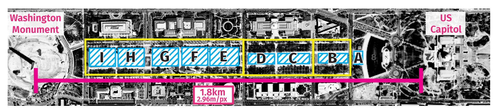
We’ll be using the national mall images from the NYT piece to extrapolate the crowd sizes, since we don’t have satelite images of the Trump inauguration yet (or atleast, that I know of). The lack of satelite imagery is a limitation because we now have to assume that the national mall is representative of the crowds outside the ticketed area.
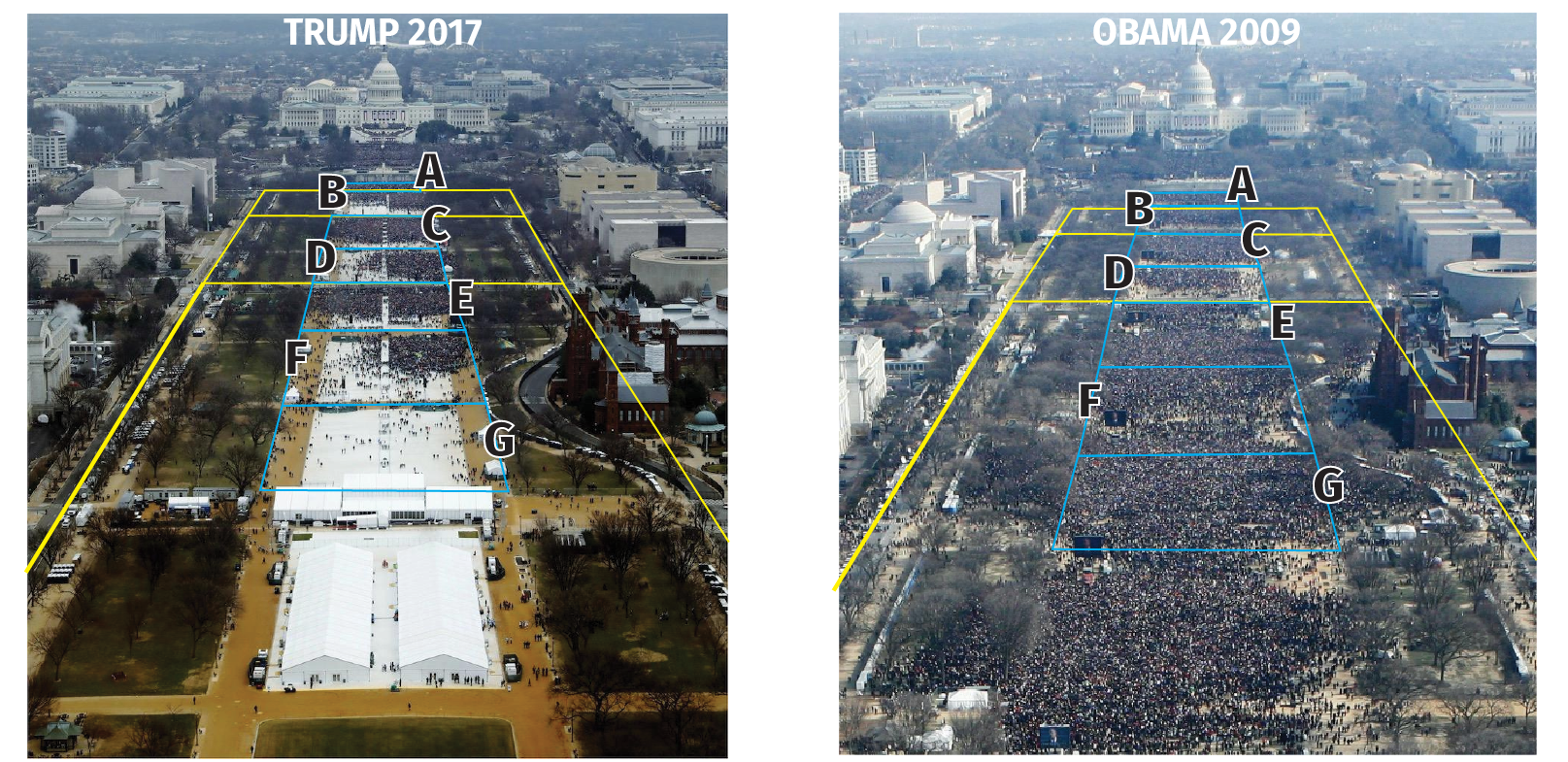
To get an idea of the size of the crowds, I’ll be (1) isolating each section of the national mall (2) project the sections of the national mall on a flat plane and (3) classifying and counting pixels as containing people or not. We’ll be ignoring section H since Trump had tents put up. Lez go!
“That Trump photo was taken before the inauguration!”
It wasn’t. According to Jim Bourg, photographer for Reuters on the US Politics beat who assigned the photo to be taken, the photo was taken at 12:01:18 p.m on the inauguration day. If for some reason you don’t believe that, you can see a timelapse by NPR’s News Hour on the day of which clearly shows the crowds in the photo are representative of the peak.
Counting the Hoards
Isolating and Projecting Sections
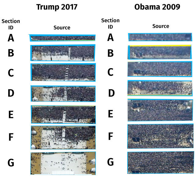
Below, we can see each section isolated, and projected on to a flat plane to account for the perspective.
Classifying Pixels
Pixels were classified as containing people (magenta) or not containing people (blue). Obstructed views (by tents, tress, etc..) will be counted as not containing people in the minimum estimate (Min column, below) and as containing people in the maximum estimate (Max column, below).
Counting Pixels
To count the pixels, the magenta and blue masked images above were converted to black and white gifs (i.e. the image palletes only had white and black). You can download the dataset if you inexplicably want to follow along.
Below is the python code I used to quantify the black, people-containing pixels.
from PIL import Image

def get_black_px(path):
  im = Image.open(path)

  black = 0

  for pixel in im.getdata():

    if pixel == 0:
      black += 1

  return black
Without further ado:
Table 1. People-containing pixels in NYT National Mall images, by section.
| Section # | Trump 2017 (Min) | Trump 2017 (Max) | Obama 2009 (Min) | Obama 2009 (Max) |
|---|---|---|---|---|
| A | 35990 | 35990 | 47558 | 47558 |
| B | 54766 | 58703 | 68927 | 71243 |
| C | 82919 | 85078 | 76493 | 79812 |
| D | 48000 | 48000 | 52603 | 54854 |
| E | 72122 | 75391 | 116704 | 127388 |
| F | 41256 | 47958 | 125428 | 128004 |
| G | 1731 | 17805 | 125380 | 128004 |
Pixels to People
Before we can know how many people are in people-containing pixels, we need to measure the width a nd height of each section using the National Mall diagram, where each pixel is 2.96 metres wide, and 2.96 metres heigh. With that, the measurements are:
Table 2. Height and width of sections in the National Mall diagram, in pixels and metres.
| Section # | Height (px) | Height (m) | Width (px) | Width (m) |
|---|---|---|---|---|
| A | 20.333 | 60.185 | 13.583 | 40.206 |
| B | 14.833 | 43.906 | 45.833 | 135.66 |
| C | 15.833 | 46.866 | 49.333 | 146.03 |
| D | 15.833 | 46.866 | 40.833 | 120.87 |
| E | 28.000 | 82.880 | 44.833 | 132.71 |
| F | 28.000 | 82.880 | 40.667 | 120.37 |
| G | 28.000 | 82.880 | 40.667 | 120.37 |
Now we’re going to figure out how much actual area each pixel will map to for each isolated section. We’ll calculate \(\text{m}^2/\text{px}\):
$$ \dfrac{\textrm{section width (m)}}{\textrm{section width (px)}} = \textrm{physical px w}\left(\dfrac{\textrm{m}}{\textrm{px w}}\right) $$
$$ \dfrac{\textrm{section height (m)}}{\textrm{section height (px)}} = \textrm{physical px h}\left(\dfrac{\textrm{m}}{\textrm{px h}}\right) $$
$$ \textrm{physical px w}\left(\dfrac{\textrm{m}}{\textrm{px w}}\right) \times \textrm{physical px h}\left(\dfrac{\textrm{m}}{\textrm{px h}}\right) = \textrm{physical px a}\left(\dfrac{\textrm{m}^2}{\textrm{px}}\right) $$
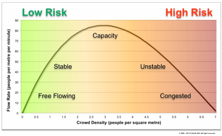
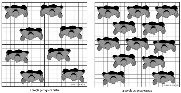
This great chart from Prof. Keith Stills himself tells us how many people fit in one metre square before things get unsafe (you can read more on his site). If we assume that the (presumably significant) security team made sure that the crowd didn’t get unsafe, we can say there were about 2 to 3 people per square metre.
We can therefore go from \(\text{m}^2/\text{px}\) to people as follow:
$$ \textrm{physical px a}\left(\dfrac{\textrm{m}^2}{\textrm{px}}\right) \times \textrm{people pixels (px)} \times \dfrac{\textrm{2 or 3 people}}{\textrm{m}^2} = \#\textrm{ people} $$
When we work it all out, we get this table:
Table 3. Calculating Number of People from Pixels.
| Section # | Innauguration | Height (m) | Width (m) | Height (px) | Width (px) | m2/px | People Pixels | Min # People | Max # People |
|---|---|---|---|---|---|---|---|---|---|
| A (min) | Trump | 60.185 | 40.206 | 59 | 610 | 0.0672 | 35990 | 4837.056 | 7255.584 |
| B (min) | Trump | 43.906 | 135.66 | 159 | 611 | 0.0613 | 57466 | 7045.3316 | 10567.9974 |
| C (min) | Trump | 46.866 | 146.03 | 174 | 613 | 0.0642 | 82919 | 10646.7996 | 15970.1994 |
| D (min) | Trump | 46.866 | 120.87 | 158 | 612 | 0.0586 | 48000 | 5625.6 | 8438.4 |
| E (min) | Trump | 82.880 | 132.71 | 179 | 612 | 0.1004 | 72122 | 14482.0976 | 21723.1464 |
| F (min) | Trump | 82.880 | 120.37 | 228 | 608 | 0.0720 | 41256 | 5940.864 | 8911.296 |
| G (min) | Trump | 82.880 | 120.37 | 221 | 614 | 0.0735 | 1731 | 254.457 | 381.6855 |
| A (min) | Obama | 60.185 | 40.206 | 79 | 602 | 0.0509 | 47558 | 4841.4044 | 7262.1066 |
| B (min) | Obama | 43.906 | 135.66 | 139 | 603 | 0.0711 | 68927 | 9801.4194 | 14702.1291 |
| C (min) | Obama | 46.866 | 146.03 | 149 | 609 | 0.0754 | 76493 | 11535.1444 | 17302.7166 |
| D (min) | Obama | 46.866 | 120.87 | 146 | 616 | 0.0630 | 52603 | 6627.978 | 9941.967 |
| E (min) | Obama | 82.880 | 132.71 | 215 | 614 | 0.0833 | 116704 | 19442.8864 | 29164.3296 |
| F (min) | Obama | 82.880 | 120.37 | 240 | 623 | 0.0667 | 125428 | 16732.0952 | 25098.1428 |
| G (min) | Obama | 82.880 | 120.37 | 213 | 629 | 0.0745 | 125380 | 18681.62 | 28022.43 |
| A (max) | Trump | 60.185 | 40.206 | 59 | 610 | 0.0672 | 35990 | 4837.056 | 7255.584 |
| B (max) | Trump | 43.906 | 135.66 | 159 | 611 | 0.0613 | 58703 | 7196.9878 | 10795.4817 |
| C (max) | Trump | 46.866 | 146.03 | 174 | 613 | 0.0642 | 85078 | 10924.0152 | 16386.0228 |
| D (max) | Trump | 46.866 | 120.87 | 158 | 612 | 0.0586 | 48000 | 5625.6 | 8438.4 |
| E (max) | Trump | 82.880 | 132.71 | 178 | 612 | 0.1010 | 75391 | 15228.982 | 22843.473 |
| F (max) | Trump | 82.880 | 120.37 | 228 | 608 | 0.0720 | 47958 | 6905.952 | 10358.928 |
| G (max) | Trump | 82.880 | 120.37 | 221 | 614 | 0.0735 | 17805 | 2617.335 | 3926.0025 |
| A (max) | Obama | 60.185 | 40.206 | 79 | 602 | 0.0509 | 47558 | 4841.4044 | 7262.1066 |
| B (max) | Obama | 43.906 | 135.66 | 139 | 603 | 0.0711 | 71243 | 10130.7546 | 15196.1319 |
| C (max) | Obama | 46.866 | 146.03 | 149 | 609 | 0.0754 | 79812 | 12035.6496 | 18053.4744 |
| D (max) | Obama | 46.866 | 120.87 | 146 | 616 | 0.0630 | 54854 | 6911.604 | 10367.406 |
| E (max) | Obama | 82.880 | 132.71 | 215 | 614 | 0.0833 | 127388 | 21222.8408 | 31834.2612 |
| F (max) | Obama | 82.880 | 120.37 | 240 | 623 | 0.0667 | 134215 | 17904.281 | 26856.4215 |
| G (max) | Obama | 82.880 | 120.37 | 213 | 629 | 0.0745 | 128004 | 19072.596 | 28608.894 |
Here it is everyone, the chart you’ve been waiting for!
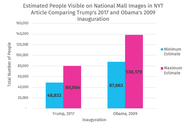
That’s just under twice as many people for Obama’s inauguration.
Well, that took twice as much time as I had hoped, but I’m just glad that Sean Spicer has some numbers he can look at.
I’ll have to write a proper conclusion to this, but briefly: this excercise served the purpose of (1) an interesting dip into crowd estimates and (2) making it clear that you can’t just gaslight the world into believing something that isn’t true. These crowd estimates don’t prove that Trump’s approval is historically low (even though it is), or that he will be a worse president than Obama. They just prove that you can’t provide alternative facts and have people blindly accept them.
Changelog
- 2017/01/24 00:46 EST
- Changed the chart from a stacked bar to a clustered bar chart, as the former could be a little misleading.
- Added a section about claims regarding the Trump photo being taken earlier than claimed, which is patently false.
- Changed a mistaken instance of \(\textrm{m}^2/\textrm{px}^2\) inplace of the correct \(\textrm{m}^2/\textrm{px}\)
- Fixed some grammatical and typographic errors.
- 2017/01/24 20:20 EST
- Changed the name of some of the variables in the formulas in the “Counting Pixels” section because they were confusing.